projects
It’s always exciting to start working with a new client, hear their vision and explore the space to start the process of curating a palette.
But I have to say, viewing the finished space, transformed by color & a fresh take on the overall decoration, can be unbelievably gratifying.
I get to do what I love while helping clients achieve their vision.
How lucky am I ?
the Wystrach-Adams Residence
Built in 1992 by architect Lloyd Wright, this Late Modernist home sits at the foothills of the Angeles National Forest in La Crescenta, California. I worked with the owner to revamp the palette which had suffered the slings & arrows of outrageous fortune, AKA the 90’s. Cues for the new palette were taken from the deceivingly complex aggregate concrete which comprises the sensuous core of the structure.


Hunt House Malibu
Designed in 1957 by architect Craig Ellwood, this classic Mid-Century Modern home sits right on the water on a beautiful stretch of private beach in Malibu. Pretty much every square inch of the structure was carefully & lovingly restored by the current owner, a connoisseur & savior of iconic Modernist homes. Layers of paint were painstakingly pulled back to reveal the original colors when possible, then with a little imaginative thinking, estimates were made as to the original intensity & texture. When that wasn’t possible, we collaborated on new choices that would fit in harmoniously as if they had always been there.


Farrow & Ball
Showroom
Los Angeles
In 2018, I was privileged to be a member of the four-person committee charged with the design & launch of Farrow & Ball’s newly-minted West Coast flagship in Los Angeles.
This fresh new space provided the perfect blank canvas to showcase the curated palette for which the company is famous. Large, sunlit spaces showcased the inherent beauty & mutability of the colors as they interacted with the architecture & changing light as well as their juxtaposition with adjacent hues. This was also a fabulous opportunity to show off the many finishes & how the sheen of each affected the read of the color.
On the ground floor, a cooler crisper, palette played up the openness of the space & provided a visually clean atmosphere to explore & construct imaginative color schemes.
Upstairs, warmer & more muted tones were featured in the open mezzanine, conference room & office spaces.
The exterior featured a vertically-striped panorama of the entire collection of 132 colors.
It was exciting to see our project featured in Architectural Digest!


Classic Apartment
Koreatown
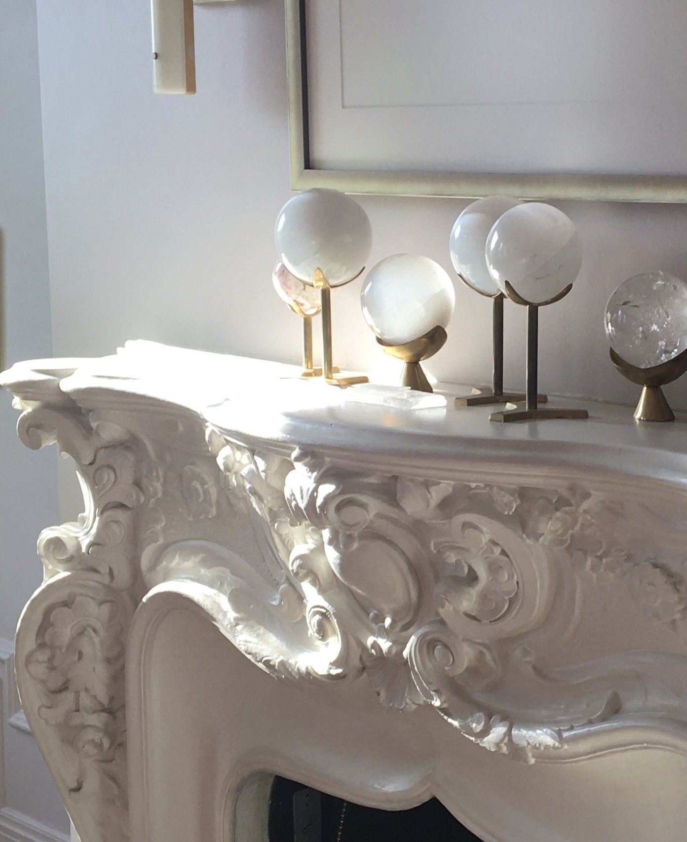
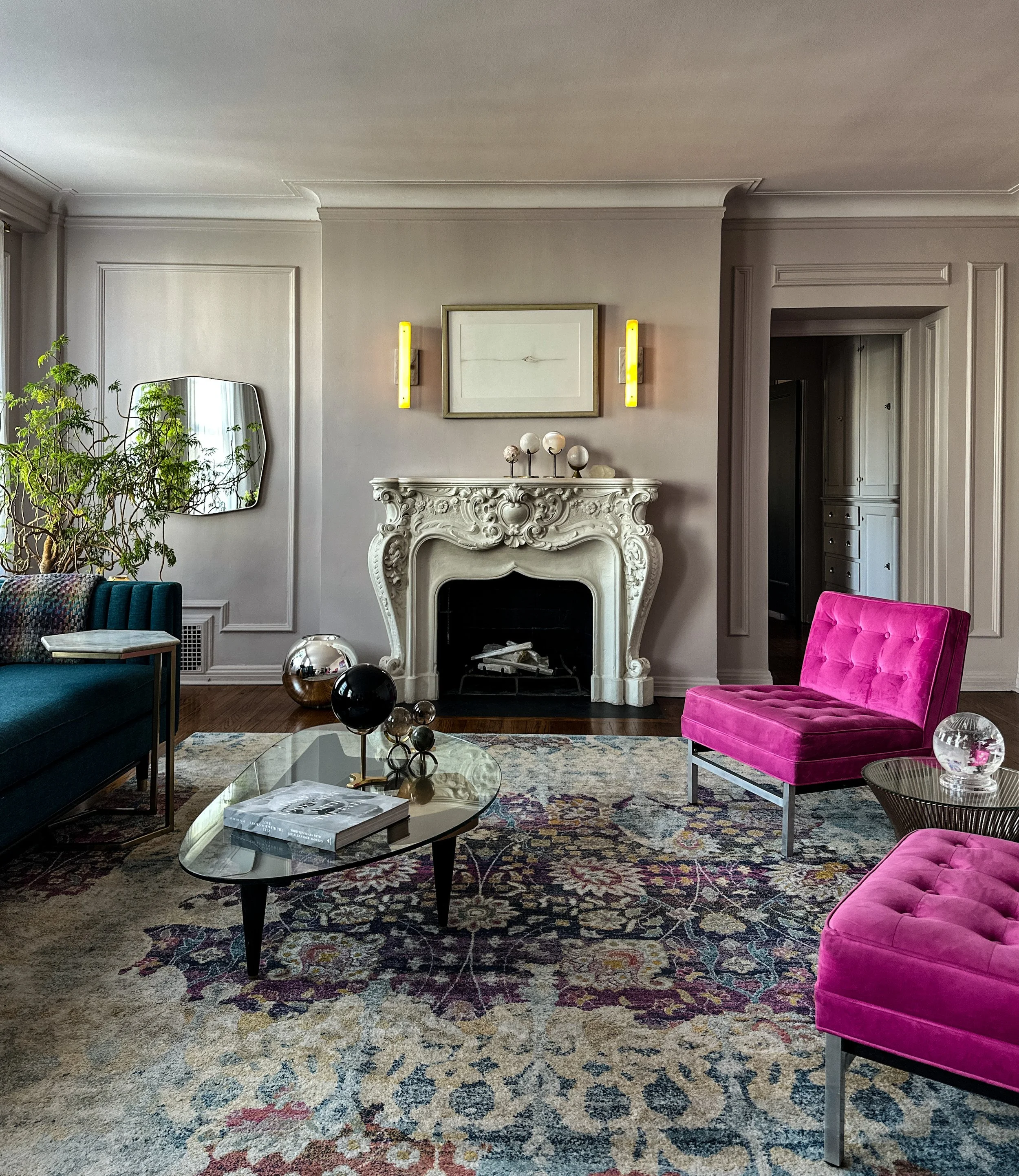
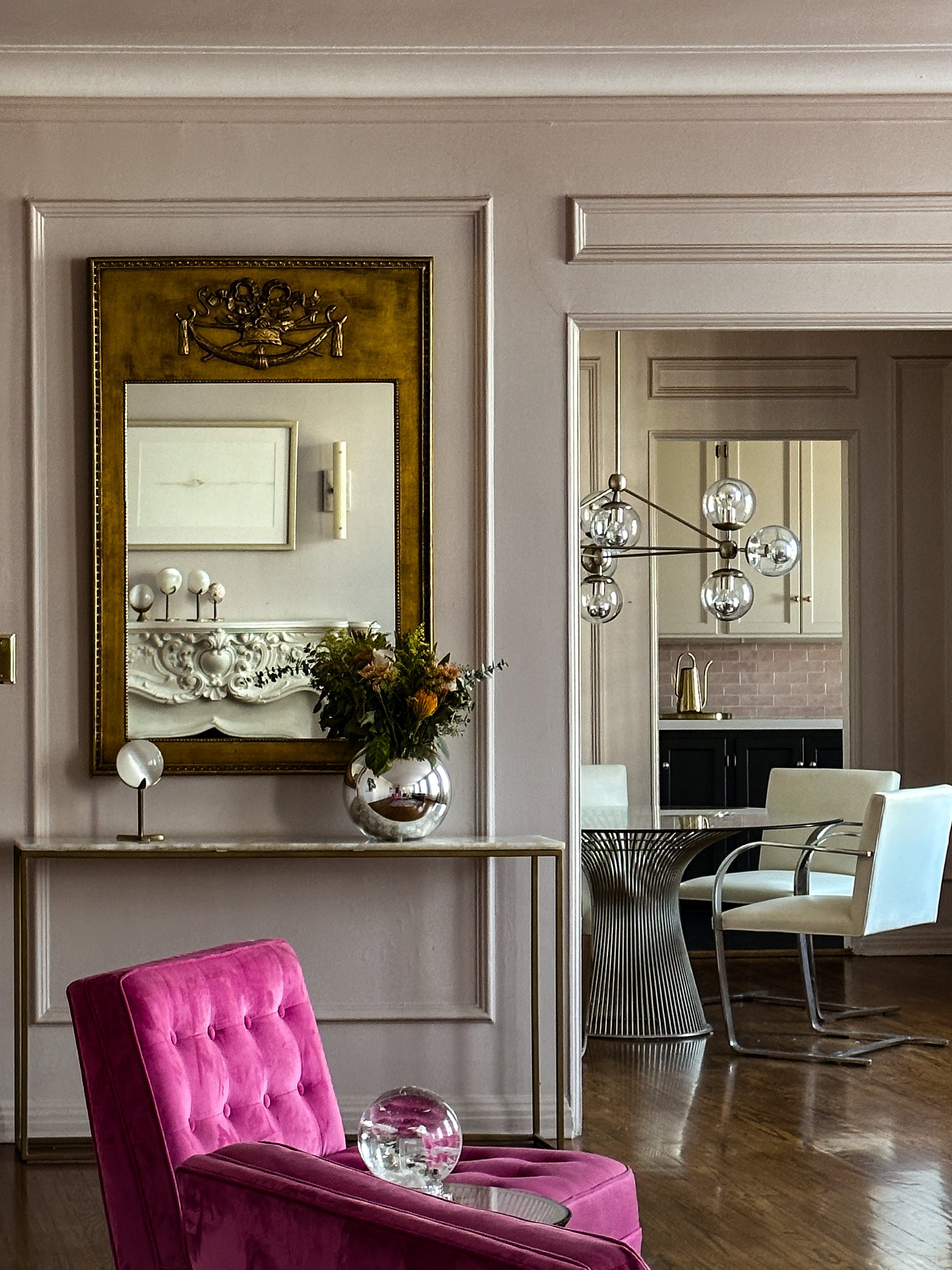
This generously proportioned 1,200 square foot one bedroom apartment was built in 1928. The gorgeous & mostly original space was an institutional gray & stark white when I met the owner to consider a new bathroom wall color after repairs for water damage were completed. Out of curiosity, she asked what I would do with the overall space & I said, This could look like an apartment in Paris. Intrigued, she asked about a color palette. I started from scratch with a decidedly fresh & feminine approach. A lovely grayed lavender anchored the walls in the main living area & a barely pink white on the ceiling softened the transition. In the bedroom, a deep rosy pink enveloped the walls for a more intimate feel & the wall color from the main space was applied to the ceiling. Throughout the apartment, doors were done in a deep charcoal black to anchor them to the floor & play up the classical feel of the space. She was so happy with the results, we ended up working together on renovation of the kitchen & bath. In the kitchen, a soft pink tile played off the adjacent palette. The space was anchored by painting the lower cabinets in the same black as the doors which echoes the matte black flooring. From there on up, surfaces were treated in the same pink-toned white as the neighboring ceilings. In the bath, we played up the feminine curves of the fixtures with a clean soft lilac color on walls & ceiling. A few details that really make a difference here are 1) treating the walls as a continuous plane with baseboards & moulding in the same tone, 2) keeping the palette limited to be easier on the eye & 3) switching out all the switches & outlets vintage-inspired black with unlacquered brass plates.


Family Home Pasadena
Originally designed as an ADU & built largely by the owners, this house became the primary residence for the young family. Exterior walls are cinderblock, providing a textural change from the smooth surfaces of partitioning walls of the home. This created a unique opportunity to play the surfaces off each other in color as well. The couple were not happy with their original color choices & wanted a more bespoke palette. All the colors have an underlying gray-green tone, which helps to unify them (& not challenge the eye) & I employed my favorite trick of the trade: carrying the wall color from the larger, more public spaces onto the ceiling of the more intimate ones. Switching out the stark, primary vibe for a more harmonious grouping, & swapping out some lighter for darker selections, the space came together providing a calming refuge for this busy young family.


